Through nuviun’s new DataVision, we provide the first in a series of articles to offer an introduction to data journalism and data visualization—with 7 outstanding examples of projects in health and technology.
In recent years, we have witnessed an explosion of open data. Open data can come from a variety of sources: governments such as the EU Open Data Portal, the World Bank portal or Data.gov; research organizations; private companies; and even crowd-sourced data.
SINTEF notes that we all produce and release data about ourselves. It released research on big data growth in 2013, saying that data could also come from our devices by moving around passively (as evidenced by Airsage’s Commuter Insight Data report regarding mobile device data); data on our behavior being registered by cameras or card usage; or data from us logging onto computers and being online.
We are only at the beginning of understanding the impact of this data explosion. What we should start thinking about is how best to report with it to help readers better understand what the data is saying. Data visualization is one option.
Paul Bradshaw—data journalism pioneer, lecturer at City University London, and founder of Help Me Investigate—was quoted in a post about how to access open health data. He says that open health data sets are made available via a variety of sources. There is open health data available from the government (in the UK, for example, Data.gov.uk, hscic.gov.uk); via the Freedom of Information Act (FOI) in the UK, Europe and other nations; via informal sources (contacts sending information to journalists); or via the practice of scraping data from websites, documents and files.
Although troubled with privacy issues and an opposition, open healthcare data is on the rise. Wearable health devices can now share data with users and the community. We can track mobile locations effortlessly—a factor that made online social media data an important ingredient in analyzing, measuring and intervening in population health initiatives (check our article about HealthMap and their online public health communications).
Communicatingdata.org, who’s mission is to communicate and visualize public health data under the Institute for Health Metrics and Evaluation (IHME), states that health data is collected in many places: “Censuses, surveys, vital registration systems and registries run by governments, health records, claims data, administrative data, and data from scientific literature.”
The organization says that in order to get to the data and to understand the state of health around the world, one must identify, access, compile, analyze, and evaluate all of these data sets comprehensively. This is where the value of data journalism and data visualization come in.
“To understand the state of health around the world, we must identify, access, compile, analyze, and evaluate all these data comprehensively—a seemingly insurmountable challenge”
Source: Communicatingdata.org
Data Visualization in New Media
Data journalism has already started to transform media—and organizations like the New York Times, ProPublica and Vox have mastered the ability to tell stories via data visualization. They all ventured into a new approach for storytelling—data-driven storytelling. Having access to new sources of open healthcare data creates a tremendous opportunity for new media to provide more objective, interesting and insightful stories for readers.
When it comes to healthcare, using interactive, data-driven stories is a fairly new approach—and something we’re creating at nuviun. So, we wanted to help introduce the concept by highlighting some great examples. For this first article in our series, we selected seven of the most impressive interactive data visualization projects—to help you experience the power of data journalism for healthcare first-hand.
1. David McCandless: Scientific Evidence For Popular Health Supplements
This interactive visualization shows the tangible human health benefits derived from health supplements when taken orally by an adult with a healthy diet. His visualization is also truly interactive and even updateable if new research evidence appears—since it can be updated via a Google Doc. It is a truly long-lasting and impressive work—whether relevant for doctors and medical professionals recommending health supplements, or patients consuming them.
What is healthy for you, what isn’t?
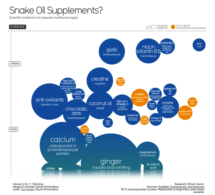
Source: Information is Beautiful. Access the interactive visualization.
2. GE’s Visualizations
GE has a whole section dedicated to data visualization—and a few are focused one of GE’s core businesses—healthcare. GE states that in all of the four industries they operate, they currently generate petabytes of data. This data contains valuable information that could drive insights, innovations, and discoveries. Although the use of visualizations is a common marketing practice—and that’s not the focus here—some of these visualizations are so well-done that they have to be shared. The one problem with GE’s visualizations is that the data is not downloadable or accessible—so it’s not open data. How can I trust a visualization if I don’t have access to the full data? I’d suggest that GE open up their data—which would make independent analysis and interpretation of the data possible.
“It can be difficult to access and digest the petabytes of data. Using data visualization, we’re pairing science and design to simplify the complexity and drive a deeper understanding of the context in which we operate.”
- GE website
Overview of interactive visualizations by GE
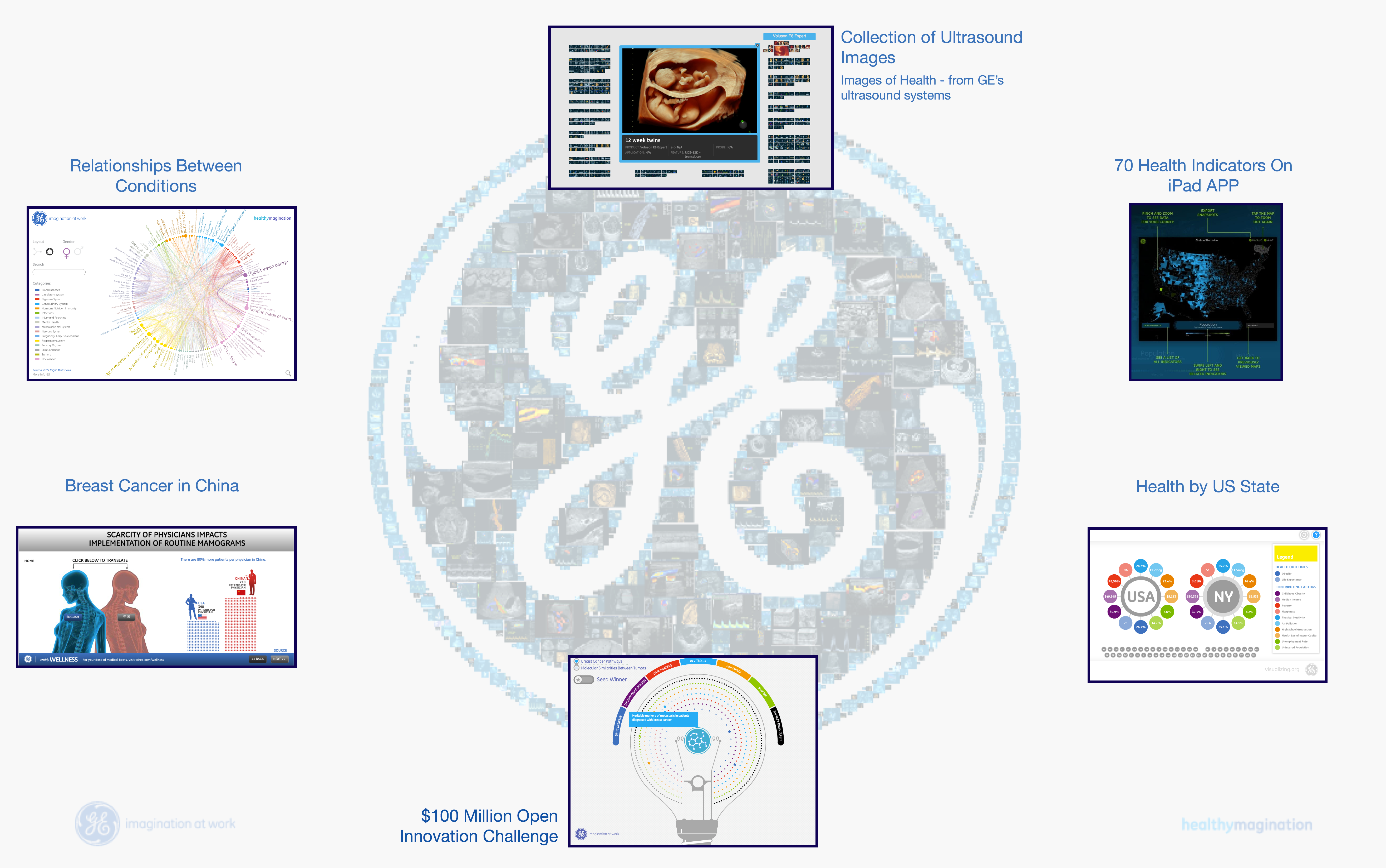
Access the interactive visualization. Source: GE Visualizations.
Relationships Between Health Conditions
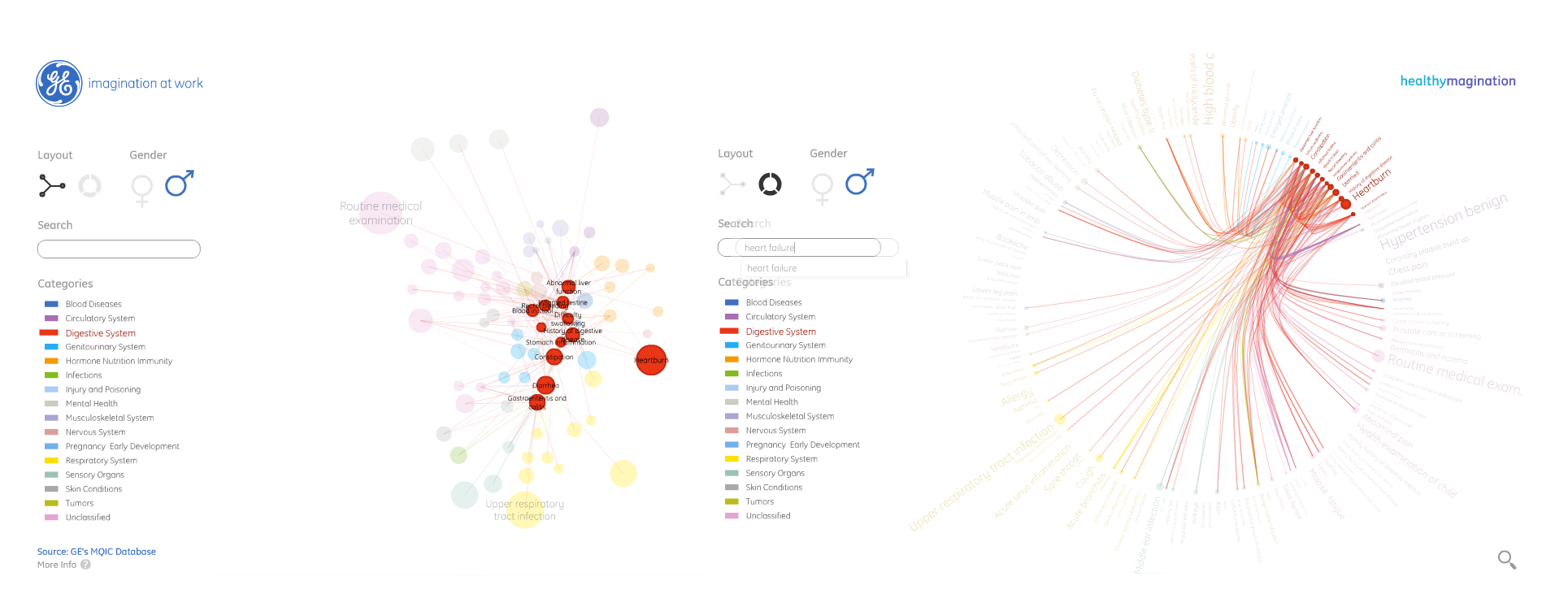
Access the interactive visualization. Source: GE Visualizations
For the illustration above, General Electric effectively used 7.2 million electronic patient health records and analyzed how conditions are connected to each other. It represents conditions that affect Americans on a regular basis and the map indicates “general trends.” By investigating how different diseases and disease categories are linked to each other, patients and doctors may understand more about condition associations, diagnosing and lifestyle impact.
24 hours & 125,000+ Medical Scans
The video above, “Curing - 24 hours, 125,000+ scans” comes from GE’s medical imagining machines, and it may help the viewer to comprehend the enormous quantity of pictures that are being processed daily. The video also partly shows where the most images are being taken (US). Readers can see the location of the scan, type of scan, and time that the image was taken.
3. The Institute for Health Metrics and Evaluation (IHME)
The IHME in Seattle is an independent global health research organization at the University of Washington. It analyses data, comes up with comparable measurements of health problems, and offers guidance for strategies to solve healthcare problems. The institute also defines major health problems that need to be solved, assesses progress in solving them, and recommends how to best invest resources to improve population health. Here is one of their most recent interactive health data visualizations:
Life-Expectancy and Probability-of-Death Map
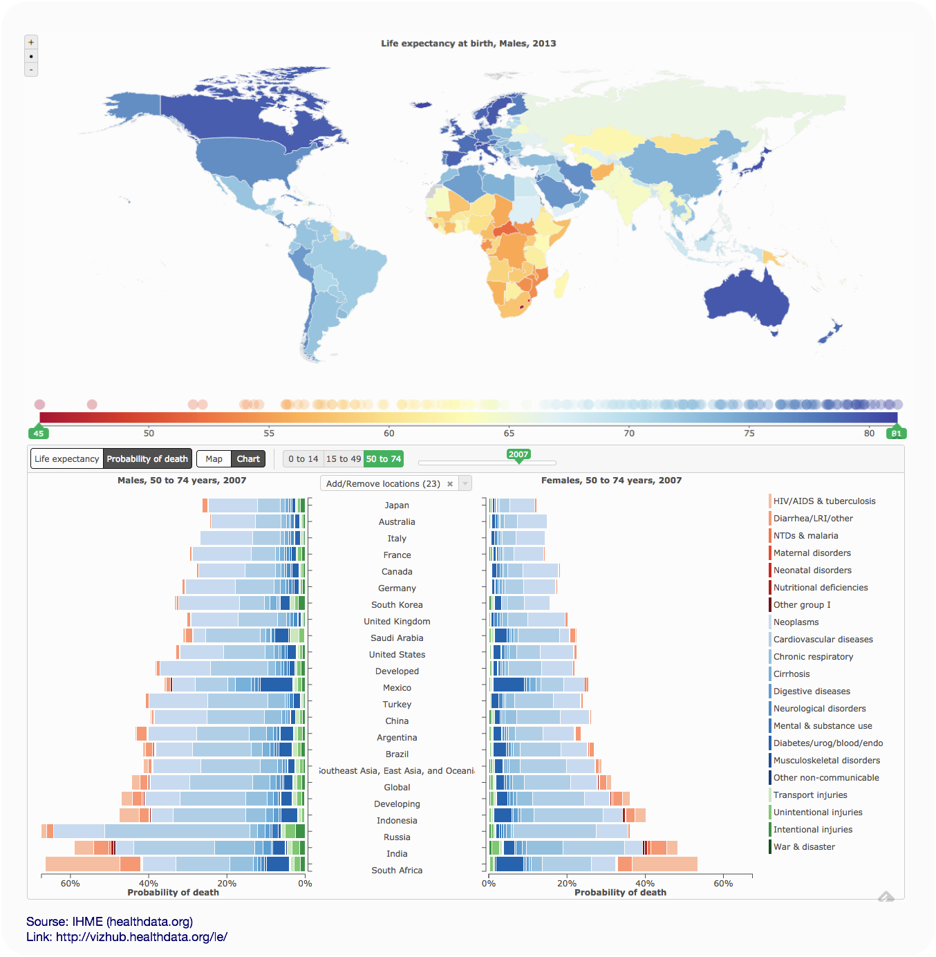
Access the interactive visualization. Source: Institute for Health Metrics and Evaluation (IHME). Life Expectancy & Probability of Death. Seattle, WA: IHME, University of Washington, 2014.
The visualization above explains how global life expectancy and probability of death changed between 1990 and 2013 for 188 nations. IHME also promises that in April the data set will be available to download. Below is a video showing how to use the interactive visualization of Life Expectancy and Probability of Death.
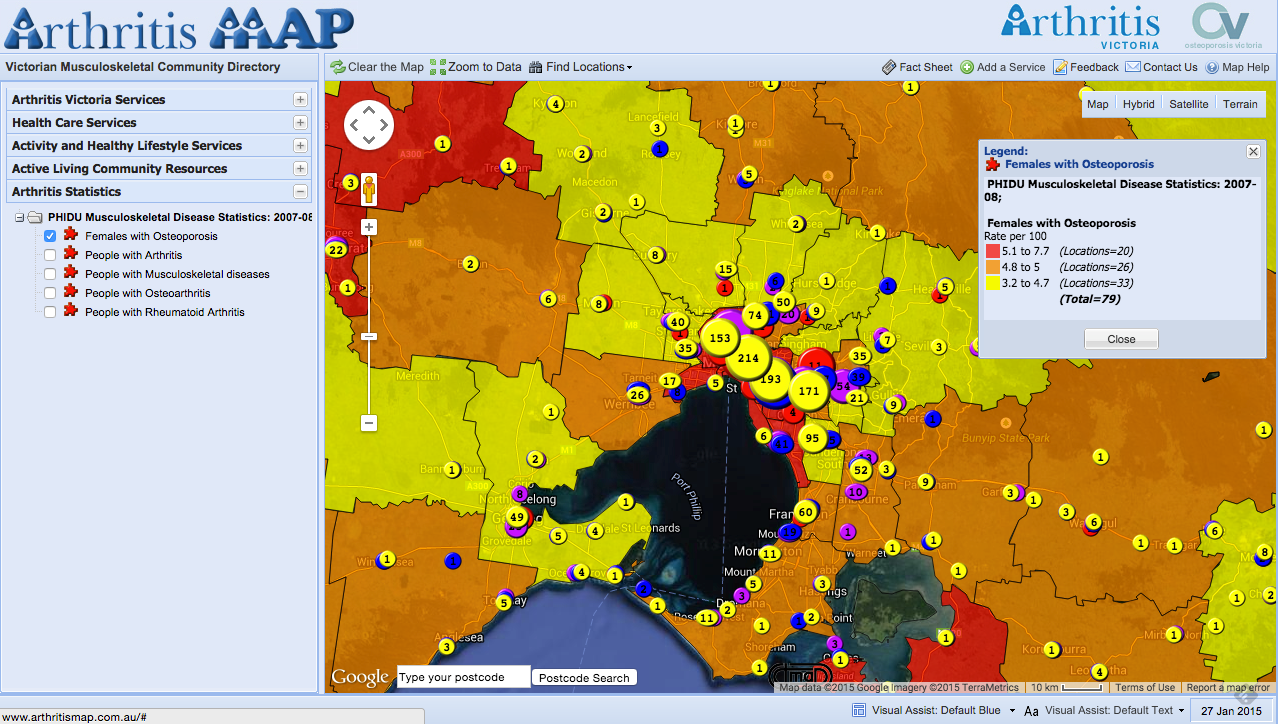
4. Arthritis Map: Public Health Data Communication in Victoria, Australia
Last year I interviewed Laurie Hawkins, project manager of the Human Services Directory (HSD), and I reported on a best practice example from Australia for health data visualization and communication. He was involved in the project. Hawkins explained why working with open health data directories and visualization of health access offers so many opportunities for health systems.
The Arthritis Map is one outstanding example of direct public health support. The community-based initiative was targeted to empower health consumers using data from the National Health Services Directory (NHSD) infrastructure. A tool was developed by the not-for-profit organization, Arthritis and Osteoporosis Victoria. NHSD can be accessed by their websites, mobile apps and APIs and is now integrated into a variety of software products.
The magic of the platform: multiple datasets are queried in one website. Hawkins explained that people with arthritis and other musculoskeletal sufferers can better self-manage their conditions by allowing them to find services and health-related information on musculoskeletal disease.
Feel free to access the interactive link of the Arthritis Map here. Add any kind of health service to the map and find out where to go and who to contact (assuming you live in Victoria, Australia). Detailed contact information (phone numbers, opening hours, addresses) can also be found.
But the map has additional features,too. It also allows you to quickly find out about public health statistics—for example, where people suffer most from arthritis—and latest statistics on subcategories, such as osteoporosis or rheumatoid arthritis. Then you could also map out categories such as public toilettes, accessible parks (Parks Victoria has even assessed the number of parks for use by people with limited mobility, sensory loss, stamina limitations or other disabilities), bicycle rails, drinking fountains and even public seats.
If this isn’t enough, you can plot over 6000 centers for recreation and lifestyle activities on your map. It seems that the map covers almost everything someone could ever need. It goes far beyond the single condition of arthritis. That is the beauty of it. Maybe it would have been better to call it something like Health Map for Victory, as the map offers so much more than what it says on the can.
Arthritis Map
Access the interactive visualization. Source: Institute for Health Metrics and Evaluation (IHME). Life Expectancy & Probability of Death. Seattle, WA: IHME, University of Washington, 2014.
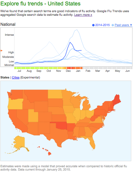
5. HealthMap & Google Flu Trends
We reported about HealthMap’s journey here. HealthMap monitors the web, news media and online social media to report on and visualize public health events—then they visualize it on a map. The map on HealthMap’s website is fully interactive, also showing timelines of disease spread. There is even an app called Outbreaks Near Me. An interesting dynamic here is that due to Healthmap’s collaboration with Google, Google Flu Trends emerged.
Click on the arrow to select a geographic area:
6. The N.N.T. Visualized - New York Times Health Data Article
The New York Times has some powerful examples showing best practice work in data journalism. For health data projects the NYT presented some well-visualized data-driven pieces on how to communicate health research and health information to its readers.
One of the NYT’s most recent examples is a piece on the Numbers Needed to Treat, or N.N.T. The concept was derived from a paper in 1988, and developed into an open information database for doctors and the public to find out how many people must be treated for one person to receive benefit from a drug or a treatment. The NYT makes a valid point that people may be surprised by learning that it’s not as simple as saying that if a patient is given a drug, positive results will follow. Some might get better, some might not. It’s essentially a statistical play. The central organization running the research is the NNT Group.
N.N.T. Examples
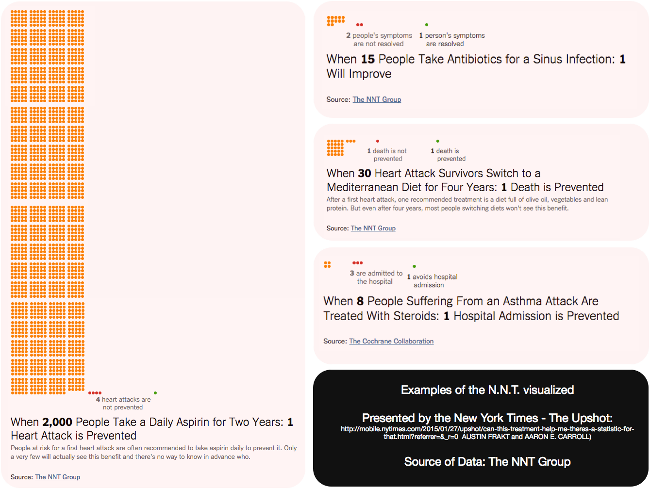
Access the interactive visualization. Source: The NYT.
The NYT picked a few interesting examples from the NNT Group data base. For instance, if 2000 patients take an aspirin daily for two years, it would statistically only prevent one heart attack from taking place.
If 30 heart attack survivors would switch to a Mediterranean Diet (explained here by NHS Choices) for a period of four years, this would only prevent one death (although another study found that in general people on it have a 30 percent lower risk of heart disease and stroke).
In addition, in the example, we see that when eight people suffering from an asthma attack are treated with steroids, statistically only one hospital admission is prevented—and that only one out of 15 people taking antibiotics for a sinus infection may see improvement.
What might be surprising to many is that the N.N.T.s are often much higher than most people would expect—which is what the piece describes. It might be higher than one, double- and even triple-digit N.N.T.s, which is common. You can access the interactive part of the NYT’s visualization here.
7. One Human Heartbeat
Last year, Jen Lowe—a data scientist with New York University’s Interactive Telecommunications Program—decided to put her heartbeat online and allowed real-time visualization for anyone with accessibility who wanted to watch. Lowe was also pregnant, and in this video she explains how her heartbeat reacted to her pregnancy, and showed up on the visualization.
She used the Basis watch to record it—which allowed her to save an average heart rate for each minute. Twice a day she connected the watch and uploaded her latest data to the database. To get the full picture, visit Lowe’s blog here.
Dana Dovey, a reporter at Medical Daily wrote about it and explained the background and data privacy implications for Lowe’s project.
One Human Heartbeat
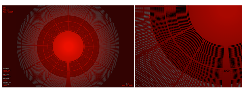
Access the visualization here. Source: www.onehumanheartbeat.com
About nuviun DataVision
At nuviun, data-driven communication for health and innovation fascinates us. We are keen to explore the hidden secrets of digital health and technology by telling data-driven stories. Who knows whether wearable health is really working unless we have a good look at the data? Who knows whether technology makes us healthier, if we don’t analyze and present the full picture of health evidence to find out what works and what doesn’t for digital health? The nuviun DataVision is our new initiative that will present work on specific data journalism projects for digital health. And we hope you’ll join us!
Ben Heubl is nuviun's data journalist who specializes in data visualization and writes about health and tech innovation. You can follow him on Twitter @benheubl.